About this blog


WELCOME! My name is Ann Mortimer and I'm a professional watercolour artist and tutor from Nottingham, UK.

This is a "learn how to" and "problem solving" blog covering WATERCOLOUR TECHNIQUES.

You can look for things that interest you in the blog archive on the side bar when various topics have built up over time!

I'll be covering thing such as colour mixing, negative painting, using masking fluid, laying washes, painting water and all sorts of other things.

Sunday, 26 February 2012

Nevada Rose painting step by step


Here is the reference photo of the rose shrub which I took in a friend's garden. I liked the way the sun was passing over the flowers and making cast shadows fall on the petals. I loved the contrast between the white flowers and the dark green leaves and crevices of dark between them.

I drew the design out lightly in pencil and masked out the bits that I wanted to protect from the first watercolour wash, ie. The buds and the stamens and one or two leaves. At this first stage, I have wet the paper thoroughly and dropped in a first wash of colour. Over the roses I have dropped in pale pinks, yellows and blues and then darker greens and blues in the areas around the flowers. I made sure to drop in some areas of yellow randomly in the leaf area which would represent sunshine falling in and among them.Already at this stage the process of finding different layers of depth has begun.


At this stage I have found the flower shapes by painting negatively round them with mixes of greens and blues according to what is behind each area, whether leaves or petals. I have dropped yellows wet in wet into the stamen area in each rose bloom to bring out the masked out stamens.
This is a close up of the rose bud area to show how negative painting has been used behind the masked out buds to bring them out. See how even in the negative background areas I have dropped in yellows and greens to give texture and avoid the "curtain behind" effect. I have then removed the masking and the buds can be painted in detail with warm pinks and yellows to make them come forward.

The rose petals were given form by painting them with a shadow mix wet in wet.
Finally the centres have been painted in. Note the negative painting in between the individual stamens in a darker yellow to give them a 3D look. Shadows cast by the stamens have been painted in with the shadow mix made with cobalt blue, a touch of permanent rose and an even smaller touch of yellow.
The flowers have been made to stand out by painting a dark shadowy area just underneath the blooms with a blue/green mix and then blended out downwards with the brush.

Friday, 10 February 2012

Walled Garden step by step demonstration.


Photographic reference.

Some friends of ours showed me this photo of their garden and I was so inspired by it that I gave them the painting I made of it. This is another painting based loosely on the photo.

The shadows across the lawn and the tree and dark leaves in the foreground were what excited me about this scene.

The figures in the distance would be the focal point but the tree with its cast shadows and the leaves contrasting heavily with the pale building and sky would lead the viewer’s eye to this distant point.


Drawing stage 1

I have masked out with masking fluid the people, the window frames, some flowers in the borders and I’ve splattered some masking fluid in the leaf area top left to give sparkle and light.


Palette

Here are the colours mixed in the palette ready for the first wash. To paint this scene, I needed greens for the lawn and the leaves, a natural stone colour for the paths and the buildings and tree bark and also some bright primary colours for the flowers. I used aureolin, raw sienna, permanent rose, cobalt blue, cerulean blue, Winsor blue, Winsor violet and cobalt violet and burnt sienna.

I have loosely mingled raw sienna, rose and cobalt blue for the stone colours. Yellows and blues to make the greens, violet, rose and blue for the flowers and cobalt blue, cerulean and cobalt violet for the sky area at the top.


Stage 2

I’ve dropped in the colours wet in wet to set the scene and give a base of colours and tones.

I’ve deliberately kept the lawn area a very pale yellowy green as this represents the sunshine. If I went too dark too soon, I wouldn’t get the important contrast with the shadows going across the lawn later on.


Stage 3

Here I’ve painted the tree using mixes of cobalt blue and burnt sienna once again making sure to leave the sunny areas on the bark very pale while dropping in darker blues on the shadow side. I have brought the shape of the tree out with negative painting, dropping in dark blues, burnt sienna and greens in the spaces between the trunks.


Stage 4

I’ve painted the figures and put more detail and colours among the flowers, using negative painting to establish dark areas between the leaves and to bring one clump of flowers out against another. I’ve put some detail on the buildings but kept the effect soft so as not to draw the viewer’s eye away from the focal points.


Stage 5

In this final stage I’ve painted in the leaves at the top with single strokes of the brush bringing them down low in front of the buildings and house in the background. This increases the sense of depth in the scene. I put the branches and twigs in next joining up the leaves in a natural way. Finally with a dark blue/green mix, I put in the shadows with quick strokes of the brush, making sure not to go over the same area twice. The shadows need to look transparent and so it’s important to drop them in and then leave well alone! A bluer shadow colour was passed over the flower bed on the left, leaving some areas light, with the effect of making the right hand side flower bed look more sunny.

Wednesday, 8 February 2012

Folding palette


This is an example of the folding plastic palette I was talking about yesterday. It's available from this supplier but I have seen it elsewhere as well.

Click on the link below...


Tuesday, 7 February 2012

How to use your watercolours...PALETTES


A little tip about using your colours today.

There are two ways of buying and storing your colours

In a box of ready made PANS as in a paintbox which you wet and work up with your brush

or

In TUBES, which you squeeze out and then mix with water.

My tip, even to someone completely new to watercolour, is to buy some tubes and an empty plastic palette with a lid and make up your own palette.

I have led many watercolour day workshops where very keen painters have had to spend half an hour or so finding their colours and sorting out a way of using them. This is valuable painting time lost!
Choose a few tube colours. You could even start with just three, a blue, (ultramarine), a red (alizarin crimson) and a yellow (raw sienna). Squeeze them into separate small sections of an empty plastic palette, leaving some empty sections in between. Then you have lovely juicy soft paint to work with and to start painting with straight away. With these three primary colours you can mix all the colours of the colour wheel.

When you can, add more colours. Perhaps a cool yellow such as aureolin, a cool blue such as Winsor blue, and a different red, such as burnt sienna.

This way you will gradually get to know your colours as you use them and not be confused with all the different names and hues.

It's important to always keep the colours topped up in the palette and leave them in the same position. Then you get to know the colours simply by where they are in the palette. And they will be ready to use as soon as you open the lid. No desperate searching around!

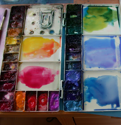
The photo above shows my palette. You can see that I've got the different hues, yellows, reds, blues, greens together in a sort of colour wheel. They are tube colours squeezed out into the small sections and I have got some colours ready in the big sections to use in a painting.

I've been using this palette for years and have collected the colours I use most in it. It took some time to do that. I keep topping up the colours and they stay moist, especially if I spray them with a small water spray before starting to paint.

People often get confused with the different blues...well if you have them together like this, you can see the difference between the warm flat cobalt blue and the cool brighter Winsor blue. You soon get to know them and this makes your choice of which blue to use so much more straightforward.

The tube colours...I use Winsor and Newton Artists...and the empty palette are available on line.

Enjoy setting up your palette!

Thursday, 2 February 2012

Autumn leaves and negative painting.


On this same subject of negative painting I came across this photograph taken last year when I was preparing for an Autumn colours workshop. It's a good example of how the technique keeps coming up no matter what your painting subject matter.

(You can click on the image to enlarge it.)

Using the collection of leaves in front of me as inspiration for colour and shape, I have laid a first wash bottom right.
I've used a variety of colours as in the real leaves and have dropped them randomly on to wet paper. I've made sure to leave an interesting broken edge around the outside of my vignette to represent leaf edges.
You can see the drawn pencil lines underneath the wash and now I'm about to paint around and between those pencil lines with darker washes of the same colours in order to achieve the finished effect in the Autumn Leaves painting on the left.
Once I've painted the spaces in between the leaves, I will allow this to dry and then go into this wash again to find more negative shapes to represent more leaves underneath.

So another example of negative painting in use.


Saturday, 28 January 2012

Negative painting with daffodil leaves

This is a follow up of the negative painting post where I am helping you to SEE things negatively and positively. In the following step by step, I have concentrated less on the colour mixes etc. and more on the ways of seeing the subject.
So the best way to use this is to scroll up and down and compare the different stages including my reference photo and see the differences and how the stages have been achieved.
I'm concentrating on the leaves here...as this is where the negative painting is used most. (I'll deal with white flowers and those backlit shadows another time. Promise!)

So how on earth do you paint these flowers and leaves so they look as though they are naturally growing in a garden? How do you get that depth of field? Well its important to OBSERVE, look really carefully at the photo and see how it all works.
It's a mass of greens but there are different TONES of green there, some almost light yellow, some almost a bluey black.
When you are observing like this it's a good idea to half close your eyes and then you lose some of the colour information and see the tones, the light and dark in a more simplified way.
This also helps you see the scene as a series of SHAPES rather than flowers and leaves.
When I look at the photo with half closed eyes I see different sized rectangles and triangles of tone. Seeing these shapes and trying to copy them will help you with the negative painting technique

This is the drawing before any paint has been applied. Following the photo, many leaves have been portrayed as turned over towards the viewer. This is very characteristic of daffodil leaves and when they do this, the light falls on them in a distinct way.
Look really carefully at the photo to see what I mean. The tops of the leaves are light and the underneath areas are dark. Sometimes between the leaves you can see a distant very dark piece of soil or bark of a tree which is brown /black, sometimes you just see other leaves which are green but a darker tone of green, almost blue.

Well you've looked at the reality. Now you have to use the TECHNIQUES, the PLOYS to achieve the natural effect. This basically is a con, a series of tricks! We're painting on a flat piece of paper, but we have to make it look as though it's 3D.
A general yellow/green/blue wash has been applied over the leaf area, once again making sure that some of the yellow has been left on the forward facing leaves to denote sunlight.
This is an important part of the negative painting process as yellow makes the leaves come forward and the blues make things recede. You start to get the depth straight away if you do this.
You don't have to be precise about this, just drop your colours in the general area wet in wet and have faith! The watercolour will spread and end up giving you a natural look. The important thing is not to touch it with your brush. If you start scrubbing the whole effect will be lost. Drop in the colours and leave them be!


So after leaving the paint to dry completely, here I have started painting the spaces between the leaves with darker tones of green.
I have used variegated washes.
In other words I have dropped in some green and added some blue and then some yellow to make the effect more natural, but the general TONE is darker than the actual leaves. Use plenty of pigment and water with these washes in between the leaves. If you just paint the negative spaces with one dark, flat colour, the effect will not look natural. You are painting a space between the leaves and there is light in there and other leaves behind. There isn't a curtain behind the leaves, it's air and light!


Stage 4 and more detail has been added to the flowers heads. Very little has been added to the leaves at this stage.


Some more of the negative spaces, the spaces between the leaves have been filled in with a darker green wash. See how the yellow from the first wash at the beginning is still visible giving a sense of sunlight hitting the leaves.
The aim is to achieve a variety of tones in the background, but each getting darker than the leaves in front. If you look back again at the photo, you see that there are lots different tones in the depths between the leaves, not just one dark flat tone.

So here you have the finished effect. Look carefully at the leaf area.
The leaves look as though they are one in front of the other.
There are very deep dark areas where there is very little light and there are less dark areas between the leaves denoting other leaves and stalks behind.
The tops of some of the turned over leaves are catching the light and the underneath of these leaves have been darkened. This adds to the sense of depth.

I've also added some cast shadows after studying the reference photo very carefully.
The general effect is I hope convincing and natural looking.

Thursday, 26 January 2012

Negative painting and a 3D effect demonstration

Here's a photo of a clematis growing in my garden. The leaves overlap each other and are casting shadows downwards. In this demo I'm trying to portray this effect.
I think this negative painting effect is born of working from photographs a lot. It aims for realism and has little to do with conceptual art or spontaneous expression and as such wont be everyone's cup of tea! I'm trying to capture a realistic sense of depth and 3D. So that, like in a photograph, you feel as if you are travelling into the painting.
Many people find this concept of painting back to front difficult to grasp. So if this is the case perhaps having a go at this demo stage by stage will make the difference.


First I made an outline drawing of leaves overlapping each other. These might be clematis leaves.


In this first stage of painting I laid a wet in wet wash. I had mixed up some yellow and some blue separately in my palette and also mixed a green by combining the yellow and blue. I wetted the whole of the paper and the dropped in yellows and greens wet in wet. I made sure the yellows went over the uppermost leaves and the darker greens went into the areas between the leaves. This started the 3D effect straight away as the yellows stand out and the greens recede. I ignored the pencil lines at this stage, just wanting to get a general effect to start with.
I let this dry completely. It 's important to allow each stage to dry completely...you can use a hair dryer!


Before painting here, you see I have drawn in some stalks in the middle depths as a guide for my painting. With a darker green (with more blue mixed in with the yellow) I painted AROUND just the uppermost leaves. Where one leaf overlaps another, I brought the darker paint underneath the top leaf to make it seem as though a shadow was being cast on the lower leaf. You can see I have painted over the underneath stalks and leaves at this stage. I let this dry completely.


Then with an even darker green I painted AROUND the underneath leaves which as a result were now standing out but were darker in tone than the very top leaves. At the same time I used this darker green mix to paint each side of the leaf stalks and tendrils that I had drawn in the middle depths, thus making another layer of depth. Once again I let this dry.


Finally I painted in some more veins on the leaves which introduces depth and form within the leaves. So the leaves themselves become 3D. I deepened the shadows cast by the overlapping leaves by going over with a fairly watery bluey green. And I was pleased with my 3D effect!


And finally here's this 3D technique used in one of my paintings. This shows a section of a clematis painting where I have used the negative painting method to portray the leaves.