Friday, 9 August 2013

A step by step demo of some hedgerow dog roses

I haven't posted here for ages, hoping that what I had already put on the blog would keep people busy.  But now it's time for more information about techniques.
I have been posting on my facebook page,
but I know that very few of the people who follow my art are on facebook.
My page on facebook
So my apologies to those people who have seen this already on my facebook page.

(CLICK on the photos to enlarge)

During my June painting course in Derbyshire, I saw these dog roses growing near the studio where we were painting.  There was an abundance of flowers and we had sunny weather so I was able to photograph with cast shadows on them and lots of lovely contrast.


This photo inspired me as I saw the potential for creating depth as the sunlight was picking up some leaves and throwing the others into the background.  Also there was a lovely cast shadow over the flowers.  The shapes of the stamens were being thrown on to the lower petals.  I knew from experience that this would create impact in a finished painting and I just love sunlight effects.

It was quite easy to make a drawing from this photo, as it was almost a ready made composition.  I tried to overlap the roses a bit more and added two more buds in a better position.

I masked out the stamens and the buds, allowed this to dry and then laid a first wash over the whole page which I had wetted with clean water.  My first wash leaves quite a bit of the page uncovered by the paint.  These spaces , such as on the lower parts of the flowers will represent the very lightest sunlit parts.
I also made sure to drop plenty of yellow over the leaves which would then appear sunlit.  There's a lot of this sort of planning involved with this style of painting.

Below is the first wash in place and then my palette showing the colours I mixed for the first stage.


First wash stage 1


Palette with colours indicated.

The scene was now set for starting to put more sense of depth in the painting.  Below is the second stage.

I've outlined the flowers with the dark mixes and the main leaves by painting into the negative shapes.  I did  this by wetting an area around the flower and dropping in colours while outlining the shapes of the petals and leaves.  You can see that I have gone in again after the first washes were dry and outlined some underlying leaves with negative painting.  The flowers and buds are still untouched at this stage.


Stage 2 with the flowers and some leaves brought out with negative painting.


Next I started  painting the flowers by wetting each petal with clean water and dropping pinks only around the edge of the flower.  The colour seeps in to the centres but the main concentration of colour stays around the edges.
I have also started putting some vein details on the leaves.  I removed the masking on the buds.


Stage 3 

At stage 4 I have painted the buds looking carefully at the photograph.  I have also started some shading on the petals by using a blue/pink/touch of yellow mix.  This was mostly to give the flowers their cup shape.  But I didn't want to overdo the shadows at this stage as that would take away from the impact of the final cast shadows.


Stage 4 Buds painted and some shadow on the petals to show form.

I painted the cast shadows before taking the masking off the stamens.  I then took the masking off and after painting them with the yellows, I had to adjust them to show some in shadow.  The painting of the cast shadows over the leaves was done very quickly and almost with my eyes shut!  Just trying to get the sense of shadows being cast by one leaf on another closely following my reference photo.  It was an act of faith really but it seems to have come out ok.  I darkened the background top left and added more darks strategically to bring out the lightest parts of the flowers and leaves.


Final painting.  

I really enjoyed painting this.  Not easy!  A lot of planning involved.  I knew what I was aiming for and it worked this time.  Not always the case.  It helped that the flowers were a simple shape, because I had enough on trying to get the shadows and tones right without having complicated details to paint in the flowers.  Hope you enjoyed following me.  
I'd be pleased for you to have a go at painting it.  But best to treat it as an exercise and then try the same techniques on your own design, and that's what I'd love to see if you do have a go.

Thank you for reading this...Happy Painting!


Thursday, 16 May 2013

Rhododendrons


What inspired me to paint this scene of sunlit rhododendrons were the cast shadows on the flowers and leaves.  I love trying to depict sunlight and shadow in my watercolours.
The colours I used for this painting were: aureolin, raw sienna, indian yellow, permanent rose, cobalt violet.
I mixed my greens with Winsor blue and quinacridone gold.  The darks for the crevices and negative spaces were mixed with Winsor blue, quinacridone magenta and gold.


First wash 
First I masked out the stamens ans allowed this to dry.
Having prepared my colours for the first wash, I wetted the whole of the paper and dropped in yellows over some of the leaves and the flower buds in the centre, pinks over the flower petals, taking care to leave light areas and then weaved in greens and blues, concentrating the darker tones towards the corners of the painting.  I let this dry.


Second stage painting negative spaces to bring out the leaves and flowers

Then with green and blue mixes I brought out the leaf and flower shapes.  


Third stage painting the flowers with pink washes

Studying the photo carefully I painted the flowers wetting the petals one by one and dropping in the pinks wet in wet on the edges of the petals and allowing the colour to drift in unhindered.  At this stage too I found more leaves within the dark areas created at the last stage by painting negatively around them.


Fourth stage putting some detail in the leaves and more flower work


Finished painting 

In the final stage, I painted the pink markings within the flowers and then with a mix of cobalt blue, a touch of pink and a touch of yellow to make a soft blue grey, I painted in the shadows and cast shadows within the flowers.  I added more detail to the leaves and then added cast shadows among them to give a sunlit look.  I removed the masking from the stamens and painted them with soft pink washes and a touch of burnt sienna on the tips.

Tuesday, 14 May 2013

I haven't been posting on here lately, much to my dismay.  Sorry to those who have logged in and found nothing here.  I have been posting a lot on my facebook page instead.

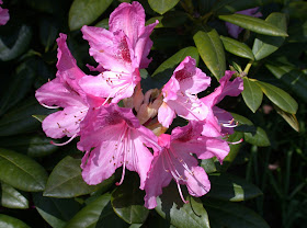
But i promise to put another step by step here over the next few days.  It is of Rododendrons.  Here is the photo to whet your appetite.


I loved the sunlight in this and the cast shadows within the flowers.

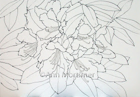
Here's the design I made from the photo.


I'll upload some WIPs next time (Work in progress!)


Tuesday, 5 February 2013

Bluebell Path step by step demo.

Following the tips, in my last post below, about colour mixing to achieve a range of blues for the bluebell wood, I thought I would upload one or two of the stages of this bluebell wood watercolour I did with a class last year.


My reference photo

First of all the reference photo on which the painting is based.  You can see that I shifted the path so it is on more of a diagonal when I made my drawing.  What inspired me about the photo, which I took at Coton Manor Gardens in Northamptonshire, was the haze of bluebells of course, but also how the gate stood out dark against the background sunlit field. I thought it would be a good focal point even though it was a bit too central.  I shifted the path to the right to provide a better lead in to the focal point.

I think it's important to be able to justify your choice of reference material or subject to prove to yourself that the thing is worth painting.  It has to inspire you or it won't in its turn inspire others!

My drawing


Before starting to paint I mixed up a selection of colours to drop into my first wash.  I needed yellows, greens, raw sienna for the path, some cobalt blue for the sky area and a selection of bluebell shades ranging from light to dark and blue through to lavenders and lilacs.


Example palette for first wash

This is not the actual palette for this painting but it gives you an idea of how much colour I would need to have mixed up. 

COLOURS
Aureolin, raw sienna, cobalt blue, Winsor blue, Winsor(dioxazine)violet, permanent rose, quinacridone magenta,
burnt sienna, ultramarine.

The greens can be mixed with aureolin/raw sienna and Winsor blue.
The pale browns for the tree trunks can be mixed with cobalt blue and raw sienna and a touch of Winsor violet.

I then wet the paper and allowed the water to soak in and then lightly wetted again so that there was a sheen on the paper.  
IMPORTANT POINT:  Because I was dropping colours on to wet paper my paint needed to be quite thick like single cream.  The colours would also dry lighter, so I needed bright thick colours to start with.

Stage 1 First wash

I dropped in yellows and greens in the field behind and over the tree area where there would be fresh Spring green leaves.( You see I have masked out some leafy areas to retain light.)  I avoided dropping yellows in the bluebell area and instead dropped in the blue mixes using a weaving action with my brush and leaving some areas unpainted for light and then greens among the blues.  Be quick with this stage, drop in the colours and then pick up the board and tip it this way and that to allow them to spread and paint themselves. Don't go back in...be happy with what you have.
At this stage I left the tree trunks unpainted to keep things simple.
Then I allowed this to dry.

It's good to be aware of colour theory a bit and realise that the blues need to be put on to white paper to be clean and bright.  Dropping blues into yellows and greens will not give you the true colours you need for this subject.

I painted in the very distant tree line with a mix of raw sienna, cobalt blue, greens and violet.  They need to be vague, cool in colour (mix in blues) and not too insistent to make them recede.


Stage 2

Colour mix for tree trunks

The next job was to paint in the TREE TRUNKS.  
I used raw sienna, cobalt blue, some Winsor violet loosely combined to make a soft grey brown.  I painted the trunks from the bottom up putting down a pale base colour and then dropping a darker mix ,wet in wet,
on the left hand side of the trunks away from the light.  ( you could use some of the dark brown fence mix below for this).  I left areas unpainted to give an impression of leaves coming in front of the trunks.  In other words I painted negatively around the leaf shapes.  As I got to the top of the trees I used a rigger, size 3 to depict the slender branches and twigs.  Notice that the tree branches disappear off the top of the painting.  Let them continue off the painting as in the reference photo, they mustn't end at the edge of the paper!!

The HEDGE along the fence line was painted in with yellows and greens with random strokes of the brush used on its side to give a broken dry brush effect.


Stage 3

I painted the FENCE in next.  I used the cobalt and ultramarine blues and the burnt sienna to make a rich brown.  The gate needed to stand out boldly against the yellow/ green field in the background, and the fence was painted with a hit and miss method to give the impression that it disappeared behind the hedge here and there.
Colour mix for fence

Next I had to make the BLUEBELL AREA look as though individual bluebell flowers were growing.  Using different mixtures of blues from light lavender to dark purple I held the brush loosely and allowed it to fall on the paper vertically to create textures.  The effect works best if you choose a pale area of background wash and here use some darker blues which will stand out.
In the foreground I painted in some individual bluebells randomly and also some bluebell leaves using a green mix.

The SHADOWS were important to make the scene look sunny.  I mixed blues with a touch of pink and a touch of yellow to make a shadow colour.  Mix plenty!  Following the reference photo, I started the shadow underneath the hedge.  For the tree shadows I started at the bottom of the tree trunks and carried the shadows away to the left, making them go up and down with the lie of the land.

Finally I painted in some more hedge trees using greens and dry brush to pick up texture from the paper.

I painted in one or two large background trees.  These add depth to the scene but must be bluer in colour and paler to make them recede.  I think those background trees really give the painting an authentic look.


Saturday, 2 February 2013

Mingling blues for bluebell shades

The other day someone asked me for my help as to how to mix blues for the bluebell wood project in my book Flowers in the Landscape.

The following is what I suggested, with some added illustrations to help clarify.


You are using the right colours.  The problem will be in the WAY you are mixing the colours.

So here are some very important tips...

Always start with a pale blue such as cobalt.  Mix a good amount of single cream consistency paint in a spacious palette. Then when you add another colour to this, such as a touch of permanent rose or Winsor violet,  DO NOT add it into the centre of the pool of paint but put it TO ONE SIDE and gradually mingle it in bit by bit.  When you have the shade you want, STOP mixing.

You have to be very gentle with your mingling.  Use the brush gently and always lay the colours side by side before mixing together gradually and gently.


Three colours laid side by side and gently mingled

So using this method try these combinations...to render the different shades of bluebells

Cobalt blue, add a touch of Winsor violet, then a touch of permanent rose.

Cobalt blue, add a touch of Winsor blue, then a touch of quinacridone magenta.

For a darker mix...

Winsor blue, add a touch of Winsor violet and perhaps a tiny touch of permanent rose.

You need to experiment on some scrap watercolour paper in order to get more confident with your mixes, but I cannot over emphasise the importance of gently adding touches of colour and being vigilant so that you stop mixing as soon as you get the right shade!


Some colour swatches on scrap watercolour paper

So much for mixing the colours.

The other important thing is to know how to lay the colours on your paper to keep them clean and bright.  
When I paint a bluebell wood subject, I like to start with an all over wash laid on wet paper.  I drop the colours in wet in wet and of course for a woodland scene that involves dropping in yellows and greens along with blues and that is where the difficulties can start.  Blue/violet/pink mixes laid upon yellow and green can end up as muddy grey!

Next time I will show how to lay the colours side by side in the first wash allowing them to combine without getting muddy.

Friday, 1 February 2013

Mixing blues for a bluebell wood...coming soon!

I have recently had people writing to me asking about how to mix the blues for the bluebell wood step by step project in my Flowers in the Landscape book.

There is little that is more beautiful and magical than a sun dappled bluebell wood in May.  The blues are stunning and are actually a mix of blues, lilacs, lavenders and even bolder aqua blues.  It's almost unwise to attempt and reproduce them but we feel bound to at least try!

I thought this would make an ideal blog post to start off 2013.  To talk about what colours to use and how to mix them to achieve clean, soft beautiful blues.

Below is an example painting to show you the sort of thing I'm talking about.  Stay tuned!


And here's some inspiration from the bluebell wood at Coton Manor gardens