Following the tips, in my last post below, about colour mixing to achieve a range of blues for the bluebell wood, I thought I would upload one or two of the stages of this bluebell wood watercolour I did with a class last year.

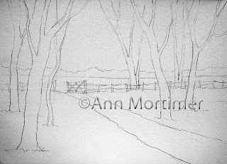
First of all the reference photo on which the painting is based. You can see that I shifted the path so it is on more of a diagonal when I made my drawing. What inspired me about the photo, which I took at Coton Manor Gardens in Northamptonshire, was the haze of bluebells of course, but also how the gate stood out dark against the background sunlit field. I thought it would be a good focal point even though it was a bit too central. I shifted the path to the right to provide a better lead in to the focal point.
I think it's important to be able to justify your choice of reference material or subject to prove to yourself that the thing is worth painting. It has to inspire you or it won't in its turn inspire others!


My reference photo
I think it's important to be able to justify your choice of reference material or subject to prove to yourself that the thing is worth painting. It has to inspire you or it won't in its turn inspire others!

My drawing
Before starting to paint I mixed up a selection of colours to drop into my first wash. I needed yellows, greens, raw sienna for the path, some cobalt blue for the sky area and a selection of bluebell shades ranging from light to dark and blue through to lavenders and lilacs.

Example palette for first wash
This is not the actual palette for this painting but it gives you an idea of how much colour I would need to have mixed up.
COLOURS
Aureolin, raw sienna, cobalt blue, Winsor blue, Winsor(dioxazine)violet, permanent rose, quinacridone magenta,
burnt sienna, ultramarine.
The greens can be mixed with aureolin/raw sienna and Winsor blue.
The pale browns for the tree trunks can be mixed with cobalt blue and raw sienna and a touch of Winsor violet.
I then wet the paper and allowed the water to soak in and then lightly wetted again so that there was a sheen on the paper.
IMPORTANT POINT: Because I was dropping colours on to wet paper my paint needed to be quite thick like single cream. The colours would also dry lighter, so I needed bright thick colours to start with.

Stage 1 First wash
I dropped in yellows and greens in the field behind and over the tree area where there would be fresh Spring green leaves.( You see I have masked out some leafy areas to retain light.) I avoided dropping yellows in the bluebell area and instead dropped in the blue mixes using a weaving action with my brush and leaving some areas unpainted for light and then greens among the blues. Be quick with this stage, drop in the colours and then pick up the board and tip it this way and that to allow them to spread and paint themselves. Don't go back in...be happy with what you have.
At this stage I left the tree trunks unpainted to keep things simple.
Then I allowed this to dry.
It's good to be aware of colour theory a bit and realise that the blues need to be put on to white paper to be clean and bright. Dropping blues into yellows and greens will not give you the true colours you need for this subject.
I painted in the very distant tree line with a mix of raw sienna, cobalt blue, greens and violet. They need to be vague, cool in colour (mix in blues) and not too insistent to make them recede.

Stage 2

Colour mix for tree trunks
The next job was to paint in the TREE TRUNKS.
I used raw sienna, cobalt blue, some Winsor violet loosely combined to make a soft grey brown. I painted the trunks from the bottom up putting down a pale base colour and then dropping a darker mix ,wet in wet,
on the left hand side of the trunks away from the light. ( you could use some of the dark brown fence mix below for this). I left areas unpainted to give an impression of leaves coming in front of the trunks. In other words I painted negatively around the leaf shapes. As I got to the top of the trees I used a rigger, size 3 to depict the slender branches and twigs. Notice that the tree branches disappear off the top of the painting. Let them continue off the painting as in the reference photo, they mustn't end at the edge of the paper!!
The HEDGE along the fence line was painted in with yellows and greens with random strokes of the brush used on its side to give a broken dry brush effect.

Stage 3
I painted the FENCE in next. I used the cobalt and ultramarine blues and the burnt sienna to make a rich brown. The gate needed to stand out boldly against the yellow/ green field in the background, and the fence was painted with a hit and miss method to give the impression that it disappeared behind the hedge here and there.

Colour mix for fence
Next I had to make the BLUEBELL AREA look as though individual bluebell flowers were growing. Using different mixtures of blues from light lavender to dark purple I held the brush loosely and allowed it to fall on the paper vertically to create textures. The effect works best if you choose a pale area of background wash and here use some darker blues which will stand out.
In the foreground I painted in some individual bluebells randomly and also some bluebell leaves using a green mix.
The SHADOWS were important to make the scene look sunny. I mixed blues with a touch of pink and a touch of yellow to make a shadow colour. Mix plenty! Following the reference photo, I started the shadow underneath the hedge. For the tree shadows I started at the bottom of the tree trunks and carried the shadows away to the left, making them go up and down with the lie of the land.
Finally I painted in some more hedge trees using greens and dry brush to pick up texture from the paper.
I painted in one or two large background trees. These add depth to the scene but must be bluer in colour and paler to make them recede. I think those background trees really give the painting an authentic look.


